Have you ever wondered how the colors you see every day on websites, social networks, apps and digital platforms in general influence your behavior? The answer lies in the so-called color psychologya field of study that finds important applications in marketing and which analyzes the way in which various color shades can modify users’ emotions, perceptions and, above all, actions. Technology companies, e-commerce and social networks use this knowledge to direct users’ choices and encourage certain behaviorssuch as clicking a certain button, purchasing a certain product or service, staying longer on a Web page, and so on. One of the best-known applications of this dynamic is the purchase button: the color of the button is often chosen to arouse a sense of urgency (red) or confidence (blue), encouraging users to click without hesitation.
The impact of colors on actions is given by the influence they have on our emotional state and on the perception of the reality around us. For example, warm hues like red, orange, and yellow evoke feelings of energy, passion, and optimism, while cool colors like blue and green induce calm, confidence, and creativity. It must be said, however, that not all colors work the same way for everyone; personal experiences and cultural differences can significantly alter the perception of a shade.
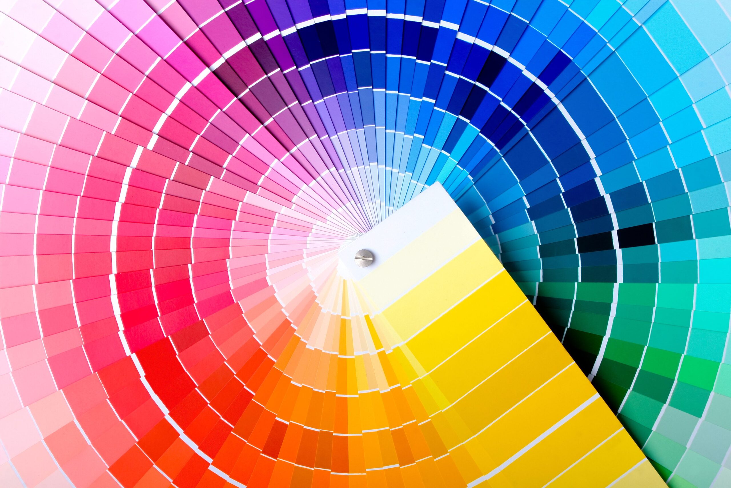
Let’s now pass some of the “lens” under the “lens”. main colors used online and let’s see how these can influence behavior.
The psychology of colors online: the meaning
Red
The red it is among the most powerful and controversial colors. Associated with energy and urgency, it is often used to draw attention to limited-time offers or important notifications. However, it is also a color that can reduce your ability to concentrate and analytical thinking. This characteristic is particularly evident in contexts such as error reporting, where red is historically linked to negative judgments. Reactions to red are not always universal: a person who associates the color with positive memories may perceive it differently than someone who associates it with stressful experiences.
Blue
The blue it is universally accepted as a color that inspires confidence, stability and calm. Not surprisingly, it is the predominant color in the logos of many technology and financial companies. When you browse a site with a predominantly blue theme, you are likely to feel reassured and encouraged to engage with its content. This effect is probably associated with the fact that our ancestors associated blue with clear skies or water sources which were synonymous with safety and prosperity.
Green
The green it is often associated with nature, growth, innovation, hope, and can stimulate creative thinking. This feature makes it ideal for work environments or creative platforms, where the goal is to stimulate new ideas and solutions. Green can have a calming and reassuring effect. It is no coincidence that it is often used as the basis of the theme adopted by e-commerce, as well as by portals that talk about finance and economics.
Yellow
The yellow it is a color that is in some ways divisive: while some people find it stimulating and cheerful, others perceive it as excessively aggressive and disturbing. This ambivalence makes it less suitable for public spaces or critical interface elements, although it can work well in specific contexts such as advertising campaigns for young and dynamic products.
Orange
THE’orange it is often used to communicate convenience and value. It is frequently seen in the “Add to cart” buttons or in discounted promotions, as it is able to convey a sense of urgency mitigated however by a certain note of positivity. Its effectiveness depends on the context: while it is perfect for e-commerce and promotional offers, it may be less suitable for luxury brands that focus on elegance and exclusivity.
White
The whiteoften used to represent modernity and simplicity, is the dominant color in minimalist designs. However, its excessive use can be sterile, boring and can strain the eyes of those who look at it, leading the user to lose interest. It is very often used by charities and organizations that deal with fundraising to encourage users to donate larger sums.
Black
The black it communicates seriousness and sophistication, but risks being overwhelming if not balanced with other colors. In Western culture it is often associated with fear, sin, mourning, but also humility, elegance, authority and privacy. Not surprisingly, it is used on some browsers when incognito mode is activated.
Viola
In ancient times the viola it was considered a rare shade, which was part of the dress code of the rich and those belonging to high social classes. Even today it is considered synonymous with nobility, exclusivity and superiority.
Color psychology also works in “offline” marketing
The applications of color psychology they are not limited to the online world, but It works great even “offline”. In combination with the various marketing strategies used in supermarkets, the colors used in offer flyers, in the products displayed on the shelves and in those present near the checkouts, contribute to influencing user behaviour.
Even in automotive sector colors can play a leading role: the red of a sports car suggests power and boldness, while the blue of an SUV can convey stability and reliability.
The choices in the use of colors by companies are never random: they are the result of years of research on how consumers perceive the various shades and associate them with certain characteristics, whether they are online products or physical objects.